New layouts: Using a template
Outside of Project Life templates I don’t use a ton of templates in my personal scrapbooking. I’ve said this before, but I have trouble using templates. I can never really envision my pictures using the space and design parameters of a template. It actually takes me longer to scrapbook when using a template than if I start with a blank page.
Lately however, I’ve been trying harder to be more comfortable with using templates. Templates are such a great way to jump start your scrappy process, and I’ve been feeling left out because I just can’t seem to make them work for me.
Here are a few recent layouts I created using templates. What I love about them is that even though I used a template, I was able to put my own personal stamp on the page.
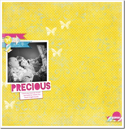
This first one is my favorite. It features a photo of Shelby reading to Cooper. So, so sweet. Whenever I catch them interacting in a loving way (there’s a lot or arguing right now), I melt a little bit and then snap a photo.
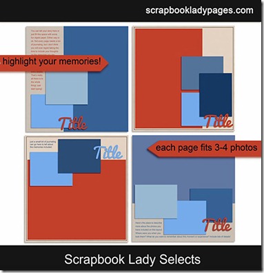
The template I used on this page was one of Katie the Scrapbook Lady’s Stunning Singles templates (see below). In this instance, I stuck pretty close to the template, adding a few subtle accents to make it my own (see the butterflies, love them).
******************************
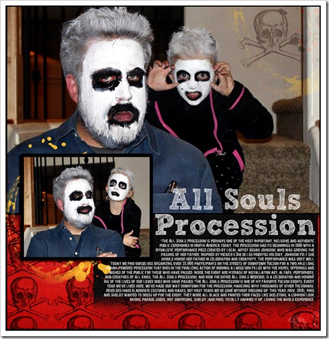
Now this page next page has the best photos ever (I know, I’m biased). They’re from 2009 when Mike and Shelby got all decked out to go to the All Souls Procession. I’ve been meaning to scrap them for ages, but just never got to them. Enter a fun template and I was halfway to done.
For this page, I used another one of Katie’s template (I’m sensing a theme here, though it was totally unintentional). This one I modified the template a little more, mostly because I only had two photos and a lot of words. I tend to lean toward templates that accommodate a really big photo or use a single, really small photo (I know, crazy extremes). This template let me shine a big light on one large photo, which doesn’t need a lot of embellishments.
******************************
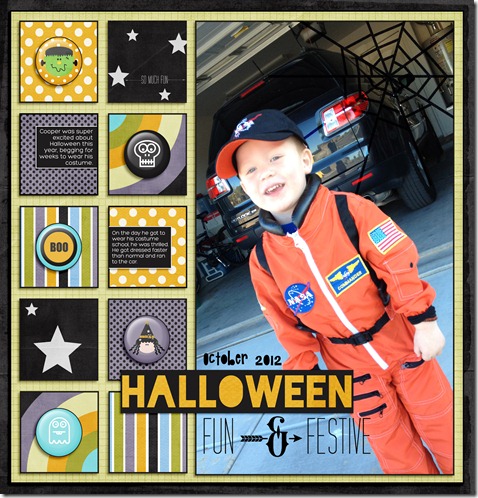
My final layout to share today is super cute, if I do say so myself … it helps that there’s a big photo of my totally adorable little boy. He’s just so stinking cute.
When I started working on this page, I had just one really good photo of Cooper in his costume and a super cute Halloween kit I wanted to use. When I saw this template (Scrapbook Lady Squares), I knew it was a perfect fit. It would allow me to highlight my single photo and use tons of the goodies in the kit. Most of the time, I prefer a cleaner, simpler look … but when I saw all the cute Halloween flair, I wanted to get as many of the pages as possible.
******************************
In 2013, I resolve to become more comfortable with template scrapping. The truth is, I don’t have a ton of time and if I want to record all or most of my memories, I have to find a way to be more efficient in the process. I think templates can do this for me. Do you use templates? Any tricks you want to share on how to get the most out of your templates? Or on how to make them more your own? Do tell.


