Tech Tuesday: Using a template (and a freebie)
If you’ve ever visited my blog, then you know I’m doing Project Life. I do it all 100% digitally. Most weeks, I have just about enough “stuff” to fill a two-page spread. But, there are a few weeks that I have more. For those weeks, I create 6x12 inserts document the extra memories.
There are lots of templates out there that can be used for inserts. I prefer to create all my inserts either 8.5x11 or 6x12, so they are smaller than the actual weekly pages.
To get lots of photos on a single insert, I created a template with nine photo spots. You can put photos in all the spots or add paper to jazz up the page (as seen in my example below) … whatever works for you. You can download this template here.
Have you used a template before? If not, here are my top three template tips:
1. Save a copy of the template with a new name. File > Save As … and then give the template a unique name (below). This way, you can reuse the template as many times as you need. If I don’t rename, I often find myself saving over the original and then having to backtrack in order to restore the template to its original form.
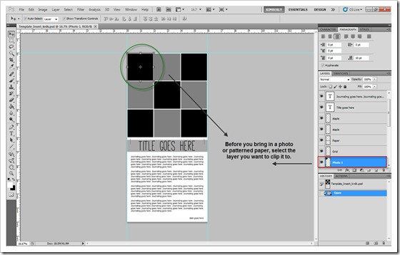
2. Before you bring in a photo or patterned paper, select the layer you want to clip it to (below). That way, the item you copy into the document (either with Control + V or a Drag + Drop) will land directly above the layer you're working with.
3. Save often. I work in the software and newspaper industry. The worst thing that can happen is if you spend hours working, only to crash and lose everything. This is I tell people, save early and save often (Control > S).
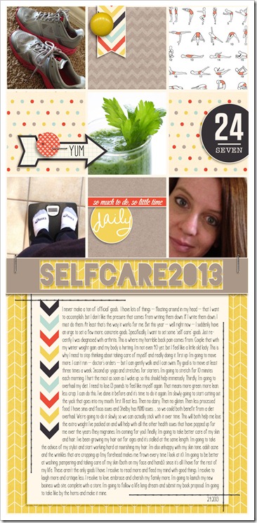
This is a layout I created using my insert template. It’s about some of my self care goals for 2013. I’m going to just slip this into my Project Life album, between this week’s pages.
As you can see, I modified my own template. I changed the title a bit, using a cool tutorial I found over here to make it look like I cut the title out with an electronic cutting machine like a Silhouette. And I added a piece of cardstock on top of the patterned background for the journaling. I also swapped out the template fonts for some other fonts I had on hand.
Now. Enough reading. Get scrapping. If you use my insert template, come back and share a link. I’d love to see what you do with it.


