New layouts: Finding my style
I’ve been scrapping a lot lately. A ton actually. I’m participating in Layout a Day (LOAD), so between that, my Project Life pages and my creative team assignments I’ve been in high production mode. There are days this month I’ve created three or four layouts. During this hyper-productive time, I’ve seen a slight shift in my style. I’m really starting to hone in on the things I love to scrap about; the techniques I like to do; and the products and colors that make me happy.
So what are some of the things I discovered? I’ve always known this, but I really like to use a single photo. And I like that photo to be either really big or relatively small. Stacked photos make me happy. I like paint, arrows and scattered elements. I don’t like using themed kits, though sometimes I’ll use them for something other than the theme or holiday they were intended for. I love, love the “cut out” look. I totally processing my photos in funky ways. Most of these things I already knew, but I was able to weed out some of the things I don’t “love” and stopped using them.
Here’s a peek at some of my recent and most favorite layouts.
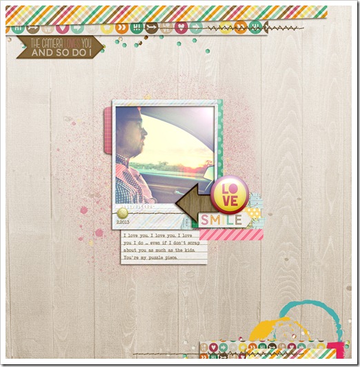
I Love You:
So, I never scrap about Mike. He was actually just complaining how I never scrap about him or us. He said "By looking at your pages people must think you're a single mom of two kids." And in the last week or so, I’ve scrapped about him multiple times. Go figure! I never create a page without a plan: a story or a photo. But for this layout, I just opened a blank canvas, picked a kit I liked and then started playing. The rest came later.
*************************************
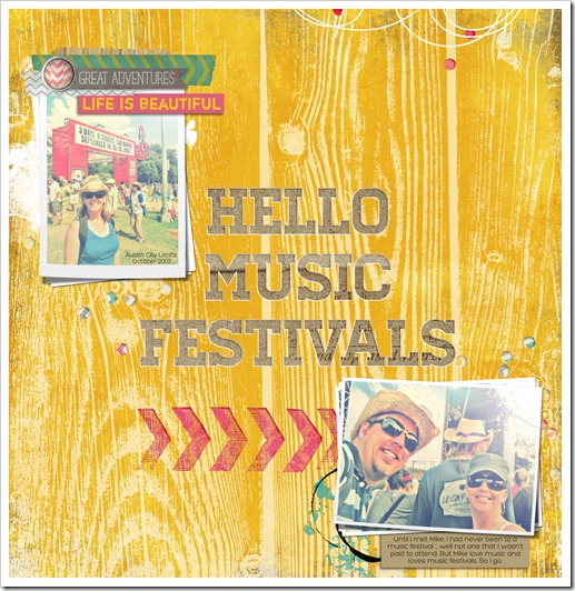
Hello Music Festivals:
These are photos of us at Austin City Limits back in 2007. Mike loves to go to music festivals. I go because he loves it. We're been to more since then and we're going to a new one this summer. I do it for love.
*************************************
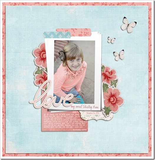
My Sweet Shelby Rose:
A little homage to my sweet (and sassy) girl. This layout features lots of things I love: Washi tape, layering and a single “stacked” photo.
Journaling reads:
At 8.5 years, you're both sweet and sassy. There are few days we don't clash. You're strong, but emotional ... creative and bright. You're such a unique, spirited and energetic little soul. I hope you always hold onto your silly, clownish self. Don't let anyone tell you you're not perfect. Because you are. You're perfect just the way you are and I love you.
*************************************
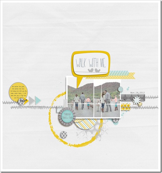
This layout is favorite for four reasons: the colors, the speech bubble, the Washi tape, and arrows. It’s not uncommon for all of those elements to show up on a page of mine. I used to shy away from repeating the use of the same elements from page to page. But l love them, so why not use them?
Journaling reads:
No matter the path. No matter the time. I will always be with you. My dear, sweet family ... I will walk with you, in this life and the next.
*************************************
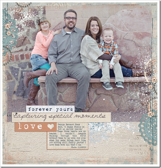
Paint splatters, a big photo and word strips … how could this not be one of my favorites. I love to highlight one great photo and this is a photo I really, really love.
Journaling reads:
George Bernard Shaw said, “A happy family is but an earlier heaven.” These three hearts are my heaven. I couldn't imagine walking through this world without them by my side. And even when thy make things hard (like not sitting still family photos) I love them with all that I am.
*************************************
What have you been working on lately? Have some favorite projects or layouts? Share a link, I’d love to check out your work!

