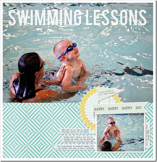
New layout: Using a large photo
I’m going through a phase right now: using super-doper large photos on my layouts. A lot of the photos I took on our recent trip to Idaho are rich, clear and bright … and I don’t want to crop them or run them small. Hence the large photos popping up on some of my most recent layouts.
This layout was one I created for Two Peas in a Bucket using a new kit from Baers Garten Designs, Summer Getaway. You can find the kit here. I used some photos I took of Cooper during his swimming lessons. He was so cute with his goggles on, cruising around the pool. He loved being in the water and woke up each morning begging to go to the pool.
When I finished this layout, Mike happened to be looking over my shoulder and he commented about how great the large photos looked, “I really like the big photo. This layout is better than anything you’ve done in a long time. You should do more like this.”
Journaling reads:
Best part of our trip to Idaho? Swimming lessons for the kiddos.Cooper didn't learn a ton, but he enjoyed the water and was much more comfortable at the end of the week. Not surprisingly, he endeared himself with his teacher, even when he wasn't listening.
**************************
Do you use large photos? Do you struggle to use them? I found a great article from Amy Kingsford on different ways to incorporate jumbo photos onto your page. Check it out here.
