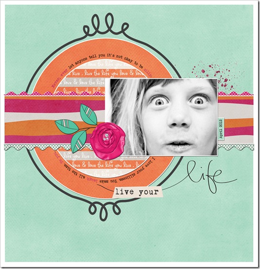
Favorite (New) Layout
On any given month, I create at least 10 layouts. Normally it’s more than that, but at a minimum I do 10. Ten marks the number of layouts that will allow me to meet the minimum requirements of all my creative team assignments (I’m active on three teams at the moment: The Daily Digi, Jessica Sprague, and Two Peas in a Bucket). Lots of these layouts I don’t get to post right away, so they sort of fade away. I get started on something else and I forget about them.
I’ve been trying to look back over my layouts on a more regular basis, hoping to save those “lost” layouts from being forgotten forever. As I looked over the layouts from the last month, this one stood out as my favorite (as of late).
I love this layout on a bunch of different levels. I love the colors. I’m an orange girl. Any chance I can use orange or wear orange, I’m there. I also love the combination of orange with hot pink and this shade of blue. Amazing I tell you.
Not surprising, I love Shelby’s silly face in this photo. I can’t count the number of times I TRY to take her picture and all I get is one silly shot after another. She’s a silly machine. If there was one photo to sum up this kid, this is it!
I also love the circular journaling. I’m a huge fan of circles and I actually started this page and its design when I was playing with text on path. I was experimenting with the path tool in Photoshop and decided to create a layout using the fun techniques I had been playing with. For me, it’s fun to try something new and it’s even better when it works perfectly with what you’re creating!
Have you tried anything new lately? Have an favorite (new) layouts to share. Link up to them in the comments, I’d love to seem them.
